

Download the PDF here
Executive summary
As a commercial event organizer, when your registration feels effortless and trustworthy, your demand turns into momentum. This is more than minor UX detail — it's one of the highest-leverage revenue moments in your entire event journey, where interest becomes commitment. Then that commitment compounds.
In contrast, treating your registration form like a data collection tool is an expensive mistake. In the commercial events world, your form is your checkout. It is the single highest-leverage revenue moment in your entire cycle. Unfortunately, some commercial organizers treat the event registration form like a database screen, a place to "collect what we might need later." That mindset quietly reduces your revenue. A paid registration flow is closer to an e-commerce checkout experience than a form. That means every extra doubt you create in the participant's mind becomes a reason to pause, abandon or "come back later" (and they usually don't, which means your event suffers).
Across conversations with marketers and event tech leaders in this guide, one theme kept coming up: registration is where your demand either turns into revenue or leaks away. Jon Monk from ASP framed it bluntly as: "The point where all your marketing delivers. Potential participants either convert or drop off." That's the commercial reality. You can run the best campaigns in the world, but if your ticket selection is confusing, your payment experience feels risky, or your form punishes users for small mistakes, you've built an expensive traffic engine feeding a leaky bucket.
The fixes aren't mysterious. They're often unglamorous but powerful: make the path obvious; ask for less; mark what's required; handle errors like a guide, not a judge; and treat mobile as your default environment, not a "responsive version." Nicola Shaw from Tag Digital described what happens when forms sprawl: "Over 60%, people don't get past page three of an event registration form." That's not a design issue, it's a revenue problem.
The bigger opportunity is shifting how you think about trust. Trust is not a badge in the footer. It's continuity, clarity and control at the moments that matter, especially at payment. Lindsey Hall from Questex put it simply: "You must be directly integrated with your payment process. It can't be a separate flow/step, it has to be part of the whole registration process." When event ticket buyers feel they're being bounced between systems, they hesitate. When they can see the total, the steps and the fallback options (invoice, support, alternative payment methods), they buy tickets to your show.
Finally, the best organizers don't guess. They measure registration like a funnel and improve it like a product. That means instrumenting step-level drop-off (ticket selection → form start → payment start → payment success) using a consistent event model, then testing changes against the biggest leak first. When you do that, your registration form stops being a cost of doing business and becomes what it should be for commercial organizers: one of the highest-leverage conversion levers in your entire event growth engine.
Who we interviewed
This guide is based on in-depth interviews with event industry leaders, each bringing their own perspective on paid registrations. Their contributions offer practical insight and forward-thinking ideas that helped shape this guide.
- Lindsey Hall — Director, Event Registration at Questex. Oversees event registration strategy and operations, including integrations and revenue optimization.
- Jon Monk — Head of Performance at ASP. Leads performance thinking for event websites and conversion-focused experiences.
- Danielle King — Senior Marketing Manager at Yotta. Leads growth and registration performance for Yotta, one of the fastest-growing events in the world.
- Rachel Stephan — Founder and CEO of Snöball. Heads up the peer-to-peer event marketing platform that helps event organizers grow attendance and engagement by turning attendees, speakers, sponsors and partners into active promoters of events.
- Elad Rosanski — Co-Founder and CEO at Xtag. Founder of an event check-in and badge printing company with a focus on onsite experience.
- Nicola Shaw — Head of Growth at Tag Digital. Runs growth strategy and performance marketing for events and registration funnels.
- Jay Weintraub — CEO & Founder at Connectiv Holdings. Builds world-leading events and advises on event technology and registration approaches.
- Tamar Beck — CEO at Gleanin. Leads an events-focused marketing technology company, with strong views on attendee trust and friction.
- Ketan Pandit — Fractional CMO and Advisor at Premagic. Works with teams on conversion strategy and lifecycle growth.
- Michael Barnett — Founder and CEO at InGo. Builds event growth and referral mechanics, with a strong perspective on friction reduction.
- Tim Groot — CEO and Founder of Grip. Leads the industry's leading AI-powered event platform, which features a registration tool built for commercial organizers.
1. Why your form drives paid registrations
A paid event registration form sits at the intersection of attention and intent. It's one of the rare moments where a buyer is actively trying to say "yes." That's why treating registration as a back-office data collection step is so costly. The primary purpose of a great event registration form isn't to gather every field you can imagine. It's to convert qualified interest into paid attendance, while setting expectations for the experience that follows.
Jon Monk described registration as the conversion hinge: "The registration process is the point where all your marketing delivers. Potential participants either convert or drop off." That framing matters because it moves registration out of the "ops bucket" and into the growth and revenue conversation.
1.1 The real purpose of registration in commercial events
Jay Weintraub from Connectiv Holdings argues that the smoothest paid registration experiences feel less like a form and more like a straightforward purchase journey. As he puts it: "How do I buy what I want to buy in the way that I want to buy it?" At a commercial event, the paid registration flow has three jobs:
1. Make the value exchange feel fair (price vs benefit)
2. Make the process feel safe (trust, clarity, continuity)
3. Make the next steps feel easy (confidence after purchase)
The registration form is where attendee psychology shifts from interest to investment, according to Rachel Stephan, Founder and CEO of Snöball: "Having a paid registration is confirming commitment. When you have a free event, people don't feel invested in showing up. Even a minimal commitment, like the trend we are seeing with major organizers charging $75 for a visitor ticket, increases show rates because if you pay for something, you are more likely to turn up."
In summing up the importance registration plays in events, Danielle King ties registration directly to the broader journey, not a single transaction: "Registration is a key part of that whole customer journey." In practical terms, the form is the start of an attendee's relationship with your event brand. If it's confusing or brittle, it undermines confidence before they even show up.

1.2 The ripple effect: Why registration is a revenue engine
Registration impacts more than conversion rate. It shapes:
• Marketing efficiency — your cost per acquisition is only meaningful if traffic converts
• Sales enablement — data quality and segmentation depend on what you collect and when
• Experience delivery — badges, onsite flows, and comms start with what you know about the buyer
Tamar Beck from Gleanin anchored this in buyer psychology and trust. She described friction and irrelevance as trust destroyers, especially when forms ask for things that don't feel necessary: "I don't want to type my address in. Don't ask me if it's not needed!" That feeling of: "why are you asking me this?" is the moment you lose momentum.
Key takeaways:
- Your event registration form is a revenue surface, not a database screen.
- Registration shapes trust, not just data quality.
- The best forms convert and set up the experience that follows.
2. Best practices for higher conversion
The form is where most organizers either win big or quietly bleed conversion. The consistent pattern across interviews is that every extra decision, field and step adds cognitive load. The goal isn't "short for short's sake." It's to remove anything that doesn't directly help the buyer pay or directly help the organizer deliver the experience.
2.1 Registration form fields: what to ask, what to avoid
A practical way to balance "data we want" vs "data we need" is to separate fields into three buckets:
1. Payment-critical (billing requirements, receipt needs)
2. Experience-critical (what you truly need to deliver access or onsite experience)
3. Nice-to-have (segmentation, enrichment, long-term marketing)
Jon Monk put it plainly: "Fewer fields almost always mean higher conversions. Ask only what you actually need." That "almost always" is important, because the exception is when a field reduces risk (for example, corporate invoicing details for high-ticket passes).
Ketan Pandit from Premagic shared a specific example of a field that feels common but often creates unnecessary friction: "One annoying and useless field is 'what are you hoping to get out of the event?'" His underlying point is bigger than that one field: buyers will tolerate questions when they see the value, but not when it looks like you're collecting data because you can.
Tamar Beck reinforced the same theme from the attendee's point of view: "The main issue for me is asking people for data that feels irrelevant or outdated."
This often translates to participants typing anything into the fields just to get to the end of the registration form. Rachel Stephan highlights how this friction leads to a "garbage in, garbage out" data problem: "It's super frustrating when you reach a point in a form that doesn't apply to you. We're in 2026; conditional logic should be the standard. If organizers ask irrelevant questions, attendees just 'check boxes' to get to the next step. You end up with skewed data because the user just wanted to bypass the friction to get to the payment."

Must-have fields for a paid event (in most cases):
• Email (buyer identity + confirmation delivery)
• First name, last name (basic identity)
• Company and job title (if it materially improves onsite experience or segmentation)
• Country (often needed for tax/VAT and reporting)
• Payment details (via secure payment UI, not raw card collection)
Fields to challenge hard (often move later):
• Full address (unless required for tax/invoicing)
• "How did you hear about us?" (track via UTMs instead)
• Open-ended text fields ("what do you hope to get…")
• Anything that can be derived post-purchase (enrichment, preference mapping)
Weintraub makes the case that conversion depends on separating what's needed to take payment from what's useful later. He recommends saving deeper profiling for after commitment: "Separate out what is needed for pure checkout but save all the other detailed data collection requirements for when they're in the right mindset."
Third-party reinforcement: The Baymard Institute's checkout research repeatedly shows that confusion around required vs optional fields and unnecessary friction contributes to checkout abandonment. Their benchmarks also emphasize that field clarity and error recovery are major usability drivers. (Baymard Institute)
2.2 Field minimization decision tree for event signup forms
Use this decision tree whenever a stakeholder asks to "add one more field."
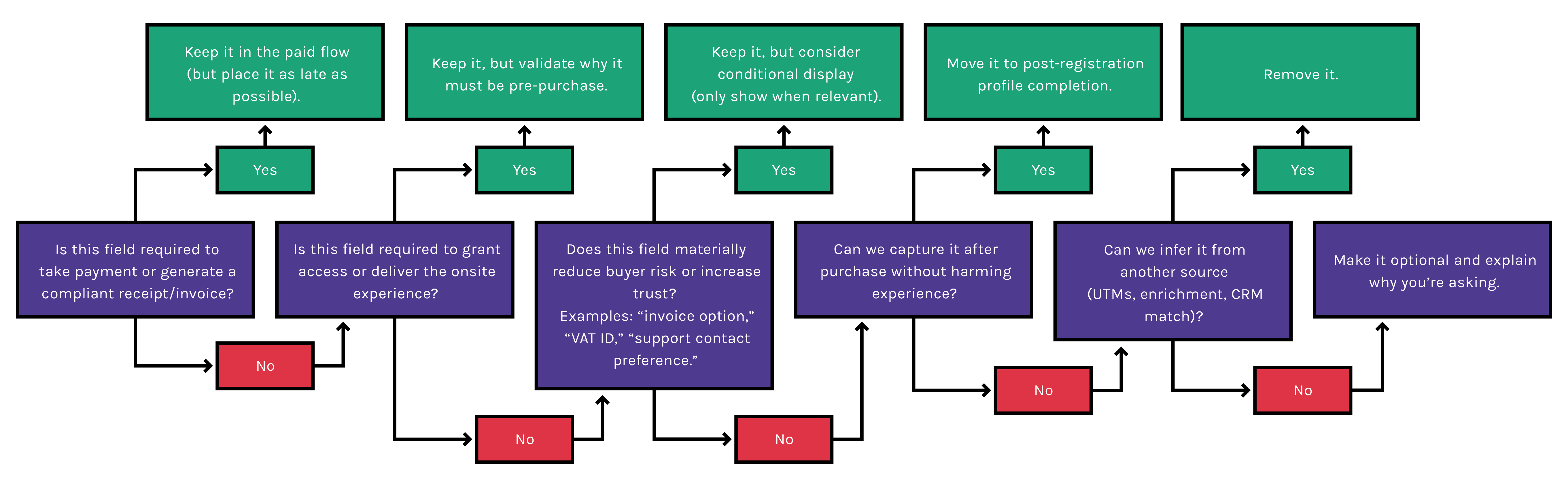
Ask in order: Is this field required to take payment or generate a compliant receipt/invoice? → If yes, keep it in the paid flow (but place it as late as possible). If no: Is this field required to grant access or deliver the onsite experience? → If yes, keep it but validate why it must be pre-purchase. If no: Does this field materially reduce buyer risk or increase trust (e.g. invoice option, VAT ID, support contact preference)? → If yes, keep it but consider conditional display. If no: Can we capture it after purchase without harming experience? → If yes, move it to post-registration profile completion. If no: Can we infer it from another source (UTMs, enrichment, CRM match)? → If yes, remove it. If no: Make it optional and explain why you're asking.
Checklist: Field minimization rules
• Remove 3–5 fields before you redesign anything else
• Make optional fields visually secondary
• Use conditional logic so niche fields don't punish everyone
• Put "nice-to-have" data collection after payment
Crucially, organizers can now minimize form length without sacrificing insight, because enrichment can happen automatically later. Elad Rosanski from Xtag highlights this succinctly: "You can gather this data later. By using AI enrichment you can gather this data by yourself, without asking attendees lots of questions."
Pro tip: If a field exists "because sales asked," convert it into a post-purchase workflow, not a pre-purchase obstacle.
2.3 Integrated payment processing: reduce friction, increase trust
Paid registration is where hesitation spikes, because the buyer is evaluating security and legitimacy in real time. Lindsey Hall highlighted the practical truth here: "Your payment step must be directly integrated into your page. It cannot be a step that removes the user from the main flow or site, otherwise you are risking cart abandonment. Additionally, as a company you are losing valuable data by not having the payment processor directly integrated to the page." That's about continuity. If payment feels bolted on, you've introduced doubt.
The objective of paid registration is brutally simple, according to Danielle King: remove anything that slows the buyer down. "My main goal with registration is to make it as easy as possible for them to give me their money," she said. This is a reminder that every added step or uncertainty costs revenue.
Michael Barnett from InGo approached it from a different angle, but with the same conclusion: make the value exchange simple and immediate. He used a vivid example of incentivizing additional data collection instead of forcing it: "Give people 10 bucks if they tell you all about themselves! The core idea is you don't demand extra effort upfront, you trade for it."
Stripe reports that showing Apple Pay earlier in checkout (rather than at the end) can materially improve conversion, citing an average 2x increase when Apple Pay is offered with its Express Checkout element compared to when it appears only at the end (Stripe). The underlying principle applies: wallet-native, low-effort payment methods can be a conversion advantage.
Tim Groot, Founder and CEO of Grip, notes there is a lot of hype around mobile wallets right now which might not translate to B2B: "We have to be realistic about B2B behavior. In the consumer world, Apple Pay is dominant. But in the corporate world, many professionals still rely on the physical card, either due to company policy, expense tracking habits, or simply because they haven't connected their work card to Apple Wallet on their personal device. If you bet everything on a mobile-first checkout, you risk alienating the corporate buyer."
Jay Weintraub also warns that invoicing workflows can become a silent bottleneck in B2B checkout if not designed intentionally: "If people need to, they can ask for an invoice. We will provide one quickly but we don't give them an invoice as part of the checkout flow as it can slow things down." Tim adds that outside the US, invoicing (with VAT/Tax ID capture) is standard and can be fully automated in the checkout flow: "There is a misconception that 'paying by invoice' must be a slow, manual process. It doesn't. Modern platforms can fully automate the capture of VAT and billing details, making an invoice request as seamless as a credit card transaction, just with a different settlement timeline."
Payment trust cues that actually help (without clutter):
• Show total price and what's included before payment
• Use recognizable payment method UI (wallet buttons, card brand icons)
• Offer a clear fallback (invoice request, alternative method, support contact)
• Avoid surprise fees at the last step
Watch out: Don't bury the buyer in "trust badges." Trust comes from clarity and continuity, not icon density.
2.4 Event registration form UX: multi-step registration, validation and error messages
Paid registration is a high-stakes moment in the attendee journey, because the buyer is doing two things at once: deciding this event is worth it and deciding this checkout is safe and easy enough to finish right now. That's why "good design" here isn't about visual taste. It's about reducing uncertainty and cognitive load at the exact moment money changes hands.
Jon Monk captured the connection between experience consistency and conversion: "There's a very direct line between how well that journey is smooth and consistent, your conversion rates follow suit." In other words, UX is not decoration. UX is a revenue lever.
Practical UX rules that convert:
• Keep labels persistent (don't rely on placeholders)
• Validate in-line and clear errors when fixed
• Make required vs optional unmistakable
• Use progress indicators if multi-step, but don't add steps just to hide length
Third-party reinforcement: Baymard's research on inline validation shows that live validation can prevent frustrating submission failures, yet many sites still don't implement it well (or at all) (Baymard Institute). Deque's accessibility guidance explains why placeholder-only labels are fragile: once users start typing, the context disappears, which increases mistakes and abandonment. WCAG's Error Identification guidance reinforces that errors must be described clearly in text so users understand what went wrong and where.
2.5 Pre-launch QA checklist for registration forms
Registration is a revenue system. A broken ticket rule, a confusing error message, a wallet payment that fails on iPhone, or an analytics event that never fires won't show up as "bugs." It will show up as "demand didn't convert," and you'll end up blaming pricing, creative or audience quality instead of the real issue.
Jon Monk recommends testing as a true first-time buyer: "Test your form like a first-time user. Does it look good on mobile and desktop?" That's not just UX advice, it's launch protection.
Pre-launch QA checklist
• Test the full flow on mobile and desktop (real devices if possible)
• Confirm required vs optional fields are clearly marked and consistent
• Confirm form labels are visible and not placeholder-only
• Trigger errors (invalid email, missing required field, card decline) and confirm messages are specific and recoverable
• Confirm payment methods work and totals are shown before payment
• Confirm confirmation email triggers immediately
• Confirm funnel events fire (form start, ticket selection, payment start, purchase)
Key takeaways:
- Every field must earn its place in a paid flow.
- Payment continuity and wallet options can reduce abandonment.
- Accessibility fundamentals (labels, errors) are conversion fundamentals.
- QA is revenue protection, not a nice-to-have.
3. Advanced strategies to increase paid registrations
Advanced tactics don't replace fundamentals. They multiply them. Once your paid flow is clear and stable, the next layer is persuasion and momentum: proof that the event is worth it, reasons to act now, and a mobile experience that doesn't quietly choke demand.
3.1 Social proof for paid event registration: testimonials and real-time signals
In paid event registration, the buyer's risk isn't only financial. It's reputational ("Is this worth my time?"), practical ("Will this help my job?"), and social ("Will the right people be there?"). Social proof works when it reduces one of those risks at the moment the buyer is deciding.
Danielle King shared a concrete example of proof linked to measurable outcomes: her event, Yotta, used Snöball — the social sharing platform — as part of registration. It delivered over a thousand social shares, leading to 54 directly attributed conversions, showing that credibility signals can drive trackable revenue when you instrument them properly. The deeper takeaway isn't "social proof always works." It's that proof and distribution can be measured when you track it properly, instead of treating registration as a black box.
According to Rachel Stephan, founder of Snöball, the biggest opportunity for social proof often happens where organizers can't see it: "On average, 31.9% of conversions come from referrals compared to just 4.4% from paid ads. But the real secret is 'Dark Social.' About 47% of sharing happens behind the scenes in WhatsApp, Slack, and Teams. If you don't prompt that share at the moment of peak registration excitement, you miss that entire untapped network of similar buyers."
Industry expert Julius Solaris notes that credibility signals often work best when they feel informational rather than promotional — such as clearly communicating what's newly announced, what's changing, and who is participating. In practice, those are "proof cues" that reduce perceived risk without sounding like hype.
Watch out: Live registration counts can backfire early if numbers are low. If you can't guarantee that "live" signals momentum, prioritize proof that shows quality (logos, speaker credibility, attendee outcomes).
3.2 Urgency and scarcity: countdown timers and limited-time pricing
Commercial buyers procrastinate because they're busy, they need internal approval, or they're waiting for a clearer reason to prioritize the purchase today. Urgency works when it provides a legitimate prioritization trigger.
Danielle King's view is pragmatic: price break deadlines are "pretty essential," because without them you risk "panicking at the end." That's the honest organizer version of urgency: it creates a rhythm to demand and reduces last-minute revenue risk.
From Julius Solaris' newsletter, one of the most useful urgency patterns is simply making reality legible: visible deadlines, clear "next price increase" timing, and sold-out tiers that reflect actual scarcity (not vague pressure). The reason this works is it doesn't ask buyers to trust your marketing; it shows them the timeline.
Pro tips:
1. Pair urgency with reassurance. If you're asking someone to act fast, reduce purchase risk with clear policies, a visible contact path, or an invoice option for high-ticket passes.
2. Reward loyalty. While most urgency is focused on attracting new buyers, Rachel Stephan suggests using your advocates to drive revenue: "We always give the best prices to new people, but what about those who come every year? Reward your champions. Give them an exclusive discount code to share with their specific network or a VIP experience. If they are your revenue generators, treat them like 'loyalty'."
3.3 Mobile-friendly registration: optimize your event signup form for mobile
Mobile registration is not "desktop, but smaller." It's a different environment: distracted users, weaker connectivity, more thumb navigation, more autofill expectations, and far less tolerance for typing.
Nicola Shaw from Tag Digital put numbers on what many organizers feel: on long forms, "over 60%, people don't get past page three." That's why mobile-friendly registration isn't "nice." It's often your biggest lever if mobile is where buyers start.
Third-party reinforcement: In-app browsers inside social apps can introduce security and privacy concerns and create inconsistent user experiences. Reporting on Felix Krause's research notes that embedded browsers can track user activity on third-party sites, which contributes to user distrust and inconsistent behavior. You don't need to panic about this, but you should test your paid flow in the environments your buyers actually use.
Mobile conversion checklist
• Use the right input types (email keyboard, numeric keypad)
• Reduce typing via autofill-friendly labels and field structure
• Offer wallet payments where relevant (Apple Pay / Google Pay)
• Keep error messages visible without scrolling
• Test in-app browsers (LinkedIn, Instagram, etc.) where your traffic originates
3.4 The "Always-on" registration cycle
Traditional event cycles rely on a "launch window," opening registration a few months before the event and closing it immediately after. Julius Solaris, founder of Boldpush, argues that this approach is a relic of the manual processing era. In a digital-first commercial landscape, his motto is simple: "Registration should always be open."
A "registration closed" banner is effectively a "do not buy" sign. It tells high-intent visitors — people who have actively sought out your event — to go away. To maximize revenue, organizers need to shift to a 365-day active cycle using three specific tactics:

1. The "peak enthusiasm" launch
The single best time to sell a ticket for your 2027 event is the day your 2026 event concludes. At this moment, brand affinity is at its peak, and FOMO is highest among those who didn't attend.
• The strategy: Have a "super early bird" or "loyalty" registration tier ready to go live the moment the current event wraps.
• The benefit: This secures immediate cash flow for the next cycle and locks in your most loyal advocates before their budget gets allocated elsewhere.
2. The "pre-register" bridge
A common objection from organizers is: "We can't open registration yet because we haven't set the prices or venue." This operational delay often leads to a dead period where no data is captured.
• The solution: If you cannot operationally open full sales, replace the "registration closed" button with a high-value "pre-register" or "2-for-1 waitlist" offer.
• The example: Tech event Web Summit is a master of this. During their off-season, they don't just ask for an email — they offer a "2-for-1" discount code for those who sign up for the waiting list. This transforms a passive email collection form into a high-intent database of buyers who are psychologically committed to purchasing as soon as registration opens.
3. Capture, don't block
Commercial events receive web traffic year-round. If a potential attendee visits your site 8 months out, they are a warm lead.
• The mistake: Displaying a static "Check back later" message, which results in a 100% bounce rate.
• The fix: Treat the off-season form as the top of your funnel. Capture their data now (name, job title, email) with a promise of "priority access." When registration officially opens, these users shouldn't just get an email — their data should be pre-filled in the live form to reduce friction.
In summary, there's no benefit to closing your shop window. If you aren't ready to take payment, you must be ready to take intent. Every day your site says "closed" is a day you are leaking potential revenue.
Key takeaways:
- Social proof works best when it reduces risk near pricing and payment.
- Urgency should be tied to real deadlines or real sell-outs.
- Mobile-first optimization often delivers the largest conversion gains.
- Keep your registration open 365/24/7 to ensure maximum revenue opportunities.
4. Revenue protection: Technology that powers your funnel
Technology choices in event registration show up as conversion outcomes. The right stack makes the buyer experience coherent, makes measurement possible and makes follow-up automatic. Conversely, the wrong stack creates redirects, breaks trust, hides drop-off and forces manual work. You should view your technology stack not as "IT infrastructure," but as revenue protection.
4.1 Integrating with existing systems (CRM and marketing tools)
You cannot optimize what you cannot see. If your registration form is a black box that only spits out "Registered" or "Not Registered," you are flying blind. Step-level funnel tracking is the foundation for improving your event registration conversion rate.
Jon Monk emphasized this "measurement loop" directly: "Looking at historical data is often the best way to predict — it always reveals valuable insight for the next event." But that prediction only works when the right data exists in the first place.
This means looking beyond basic page views. Google's GA4 recommended events provide a useful model here: even if you don't implement e-commerce naming conventions exactly, the concept is critical. You need to track behavioral milestones: Form Start → Ticket Selection → Payment Start → Purchase Completion.
What you need to track to protect revenue:
• UTMs on session entry and purchase completion: Connect the ad spend to the dollar received.
• Device and browser environment: Is your form breaking specifically on iPhones using the Instagram in-app browser? You won't know unless you track the environment.
• Step events: Where is the cliff? (e.g., Ticket select → form start → payment start → payment success)
• Payment failure reasons: Distinguish between a user changing their mind and a user getting a "Card Declined" error.
4.2 Analytics for registrations: automation, segmentation and reporting
If you are running paid acquisition, attribution arguments between Sales and Marketing are inevitable, unless you have a consistent measurement framework.
The urgency for this is growing. With the landscape of third-party cookies shifting constantly, organizers can no longer rely on ad platforms to tell them the whole truth. You need reliable, first-party measurement (UTMs, funnel events, CRM linkage) because it is the only data strictly under your control.
Rachel Stephan notes that data collection should serve the attendee's intent as much as the organizer's database: "The organizer thinks the big keynotes matter most, but the attendee wants connectivity. You must ask on the registration form: 'What is your goal for this event?' If you capture that intent at the start, you can measure if you actually delivered it at the end. It turns registration from a transaction into the start of a personalized journey."
Key takeaways:
- Integrations are for the buyer, not just the ops team: they should improve the experience and measurement, not just move data around.
- Step-level tracking is non-negotiable: it is the prerequisite for meaningful optimization.
- Own your data: privacy shifts make first-party funnel measurement more important with every passing year.
5. The feedback loop: Post-purchase and optimization
The "Payment Success" screen is not the end of the conversion story. It is simply the start of a new chapter. Post-registration is where you either cement confidence or create buyer's remorse.
5.1 Confirmation email and welcome sequence
A confirmation email is not just a digital receipt. It is the very first moment a buyer asks themselves, "Did I make the right decision?"
Danielle King describes registration as part of a longer journey, where the confirmation is the moment that journey becomes "real." If your confirmation is vague, delayed, or looks like a plain-text invoice, you reintroduce uncertainty right after the money has left their account.
Postmark's guidance on transactional email frames this perfectly: these messages shouldn't be an afterthought, but "another interface to your product or service." That framing is useful because it pushes teams to design confirmations intentionally, rather than treating them as auto-generated admin tasks.
Rachel Stephan views the confirmation page as a missed marketing opportunity: "Most confirmation emails are treated like a dead end. For me, it's the beginning. You have their commitment, now leverage it. Instead of just a receipt, ask: 'Who else can go with you?' and provide the tools to share. Don't let the momentum stop at the 'Thank You' screen."
Your confirmation checklist:
• Instant confirmation: Ticket type, date, time, and location must be visible immediately.
• Commercial clarity: Receipt and order ID for expense reporting.
• Actionable next steps: "Add to calendar," "Assign tickets," or "Complete profile."
• Trust signals: Support contact details and clear policies on refunds or substitutions.
5.2 Using registration analytics to reduce abandonment
Optimization starts by finding the biggest leak in your bucket. Nicola Shaw pointed out that "page three" is often where major attrition happens. The fix isn't to burn the form down and start over; it is to identify the specific step with the most loss and address the likely cause.
If you have a high drop-off at payment start, you likely have a trust or method issue. If you have a high drop-off at form start, your form looks too long. Don't guess — look at the step data.
Tim Groot suggests that standard analytics only tell you where people drop off, but tools can tell you why by showing user behavior: "Analytics tell you where you are losing revenue, but session recordings — using tools like Hotjar or Mouseflow — tell you why. Seeing a user rage-click on a broken field or hesitate at a confusing question provides diagnostic insights that raw numbers never will."

5.3 A/B testing: From hypothesis to revenue
High-performing registration journeys are rarely the result of a single "big bang" redesign. They are built through disciplined measurement and continuous experimentation. By instrumenting each step of the registration and payment flow, organizers can pinpoint where drop-off occurs, understand how performance varies by device, and prioritize tests that reduce friction.
An example: How to run a registration A/B test
The scenario: You look at your analytics and notice a disturbing trend: your mobile conversion rate is 40% lower than desktop. You dig into the step-level data and see that mobile users are abandoning the form specifically at "Page 2: Professional Details."
The hypothesis: You suspect the "Company Name" and "Job Title" fields are causing friction because they don't autofill correctly on mobile devices, forcing users to type manually with their thumbs. You hypothesize: "If we make Company Name optional or move it to post-purchase, mobile conversion will increase."
The test plan:
• Variant A (Control): The existing form where Company Name is required.
• Variant B (Challenger): A version where Company Name is hidden or marked optional.
• Success metric: Paid registrations per unique mobile visitor.
• The guardrail: You also watch your "Lead Quality" score. If registrations go up but sales teams complain the leads are useless, the test is a "fail" despite the revenue bump.
The execution: You run this for two weeks or until you reach statistical significance. If Variant B wins, you have just permanently increased your mobile revenue without spending an extra dollar on ads.
Key takeaways:
- Confirmations cut remorse: a good welcome sequence reduces uncertainty and improves post-purchase confidence.
- Measure steps, not just outcomes: you can't fix what you can't isolate.
- Test the leak: don't A/B test random colors; test the specific step where you are losing the most money.
6. The 9 common event registration revenue leaks
Most mistakes fall into three categories: asking for too much, breaking trust at payment, or running blind without measurement. Use this as a triage map: recognize the failure mode fast, then jump to the section that contains the full fix.
6.1 Common mistakes (what they look like + where to fix them)
1) Asking for non-essential data before the buyer pays
Why it hurts: Every extra field adds friction and triggers the "why are you asking me this?" trust check. Baymard's checkout research consistently shows poor field clarity and unnecessary steps drive abandonment.
Spot it fast: You're collecting segmentation and enrichment before payment (especially open-text questions).
Fix it: See sections 2.1 and 2.2 (fields + decision tree).
2) Unclear required vs optional fields (and inconsistent rules across steps)
Why it hurts: Buyers slow down when they can't tell what's mandatory or what will block progress — then they error, then they abandon.
Spot it fast: Users hit "submit" and get multiple "missing field" errors they didn't anticipate.
Fix it: See sections 2.4 (validation + error messages) and 2.1 (field rules).
3) Placeholder-only labels and "now you see it, now you don't" form guidance
Why it hurts: Placeholders disappear once typing begins; users lose context and make mistakes. Deque explicitly advises labels and instructions should be outside the field, not placeholders.
Spot it fast: On mobile, users pause mid-form, delete entries, or backtrack frequently.
Fix it: See section 2.4 (labels + UX fundamentals).
4) Error handling that feels like punishment, not guidance
Why it hurts: When buyers hit an error, they're already interrupted — vague messaging turns a small mistake into a dead end. WCAG guidance emphasizes errors must be identified in text and tied to the item in error.
Spot it fast: Errors appear only after submit, or messages say "Invalid input" / "Something went wrong."
Fix it: See sections 2.4 (validation + error recovery) and 7 (symptom-based diagnosis).
5) Forcing attendee assignment before purchase (especially group tickets)
Why it hurts: Corporate buyers often can't assign attendees yet — you're turning a buyer into an internal coordinator mid-checkout. Weintraub puts it plainly: "Your job as an event company is to know this group is 10 and the job is to take their money to have 10 tickets. We are not an airline, our job is not to collect their information upfront. You have to think about a flow for someone, like an executive assistant, who is buying the ticket for somebody else."
Spot it fast: Drop-off spikes when buyers hit "add attendees" or "assign tickets" screens.
Fix it: See sections 2.1–2.2 (what must be pre-payment vs post-payment), plus section 5.1 (post-purchase workflow cues).
6) Payment discontinuity (redirects, UI changes, surprise steps, or hidden totals)
Why it hurts: Payment is the highest-sensitivity moment. When continuity breaks, buyers hesitate. Stripe reports an average 2x conversion increase when Apple Pay is surfaced earlier via Express Checkout — a strong signal that reducing effort at commitment matters.
Spot it fast: High "payment start" but low "payment success," or high support tickets about "payment issues."
Fix it: See section 2.3 (integrated payment + trust cues) and section 7.1 (payment symptom diagnosis).
7) Fake urgency or pressure-selling patterns that feel non-credible
Why it hurts: Urgency works when it reflects reality; fake countdowns and perpetual "last chance" messaging can damage trust and attract regulatory scrutiny. The UK CMA has published guidance on avoiding misleading urgency and price reduction claims online.
Spot it fast: Timers reset, scarcity never resolves, or buyers message "is this real?"
Fix it: See section 3.2 (credible urgency/scarcity).
8) Performance and mobile stability issues at the checkout moment
Why it hurts: Slowness reads as risk during payment. Google reported that over half of mobile visits are abandoned if a page doesn't load within ~3 seconds.
Spot it fast: Mobile conversion is disproportionately low, especially from paid social or in-app browsers.
Fix it: See sections 3.3 (mobile-first optimization) and 2.5 (pre-launch QA).
9) "We don't know where we're losing people" (no step-level visibility)
Why it hurts: Without step events, teams argue about pricing, creative, and "lead quality" instead of fixing the real leak.
Spot it fast: You can report total conversion, but not drop-off between ticket select → form start → payment start → success.
Fix it: See sections 4.1–4.2 (instrumentation + reporting) and 5.2.
Key takeaways:
- Irrelevant fields don't just slow completion — they reduce trust.
- Payment continuity is a conversion requirement, not a preference.
- If you can't see drop-off by step, you can't fix it confidently.
7. Troubleshooting and diagnostics
When conversion drops, teams often jump straight to creative, pricing, or "lead quality." But registration issues are frequently operational and diagnosable. Treat this like a product funnel: identify where it breaks, then fix the specific failure mode.
7.1 Symptoms, likely causes, fixes
Symptom: High form start, low payment start
• Likely cause: Too many fields; unclear required vs optional; confusing ticket selection
• Fixes: Remove 3–5 fields; mark required/optional clearly; simplify ticket table
Symptom: High payment start, low payment success
• Likely cause: Payment method mismatch; wallet shown too late; confusing totals; weak error recovery
• Fixes: Show totals early; add wallets; improve decline messaging
Symptom: Mobile conversion far below desktop
• Likely cause: Too much typing; poor label behavior; in-app browser issues
• Fixes: Autofill-friendly fields; persistent labels; test in-app browsers
Symptom: Users complain "I didn't get confirmation"
• Likely cause: Email delays; spam filtering; unclear confirmation page messaging
• Fixes: Improve confirmation messaging; follow transactional email best practices
Key takeaways:
- Diagnose by step, not by gut feel.
- Payment failures are often fixable without redesign.
- Mobile issues are frequently environment and typing-related.
8. Implementation roadmap to improve paid registrations
If you could compress the best advice across interviews into one line, it's this: make registration feel effortless and trustworthy, then measure it like a funnel. Registration optimization compounds — but only if you sequence it correctly. If you start with A/B testing before fixing obvious friction and measurement gaps, you'll waste time and get noisy results. The winning sequence is: stabilize → instrument → optimize.
8.1 Implementation roadmap (7, 30, 90 days)
Quick wins in 7 days
• Remove or defer 3–5 fields using the decision tree
• Mark required vs optional clearly
• Replace vague errors with actionable messages
• Add a visible invoice/help option for high-ticket flows
Improvements in 30 days
• Add step-level funnel tracking
• Fix labels (no placeholder-only fields)
• Add wallet payments where relevant
Optimizations in 90 days
• Run A/B tests tied to the biggest funnel drop-off
• Segment by device and channel
• Audit in-app browser behavior and mitigate where it breaks conversion
9. The future of event registration forms
Future-proofing registration isn't about chasing trends. It's about understanding where buyer expectations are heading, then building flows that will still convert as attention spans shrink and privacy expectations rise.
Tim Groot argues that for annual events, organizers need to shift the mindset from "purchasing" to "renewing": "If we treat registration like an annual subscription or insurance policy — where we simply validate existing data rather than asking for it from scratch — we drastically reduce friction for our most loyal attendees. It shouldn't be 'Who are you?', it should be 'Is this still you?' This is something multi-event organizers could implement tomorrow, if they wanted."
Michael Barnett echoes these views about fewer steps and less effort, pointing to "one click" style expectations and the idea that buyers increasingly expect the transaction to be nearly effortless. Elad Rosanski from Xtag emphasized that paid flows must feel "super easy" and "frictionless." Tamar Beck highlighted the flip side: trust is deteriorating, and irrelevant data collection accelerates that decline.

1) "One-click" payment expectations will keep rising
Wallet-native checkout is becoming normal buyer behavior. Stripe's research argues that surfacing wallet options earlier can improve conversion materially. Tim Groot also sees a future where Buy Now Pay Later (BNPL) services like Klarna will enter the B2B event space: "We are beginning to see consumer concepts like 'Buy Now, Pay Later' drift into B2B. It's an interesting mechanism for cash-flow sensitive attendees: it allows them to commit to the event early while deferring the actual expense, potentially smoothing out the 'budget approval' delay."
What to do now: Treat wallet payment support as a conversion lever, not a payment add-on.
2) Event registration forms will become frictionless
The next big compression in event registration forms won't come from "asking fewer questions" alone. It will come from systems getting better at pre-filling what they can (from past behavior, enrichment, or known data) and asking attendees to confirm rather than type. Elad Rosanski believes AI will shrink registration forms dramatically: "I think we're getting towards AI completing registration forms. Because of this we will see registration flows that are very easy. Maybe we'll just ask the attendees to confirm the information we gathered on them."
Tim Groot urges caution on how AI-inferred data is surfaced: "AI enrichment is powerful for the organizer, but dangerous if you expose it incorrectly. You can use AI to segment your audience internally, but you should never show inferred data, like a predicted job title, to other attendees without the user validating it first. If the AI is wrong, you don't just look sloppy — you lose the attendee's trust."
Rachel Stephan sees the registration form disappearing entirely in favor of a concierge model: "The future of registration is less transactional and more conversational. Imagine a concierge experience where you don't 'fill out a form,' but instead speak to an AI assistant in natural language to register. It should feel less like a field-entry task and more like joining a community where you belong."
What to do now: Build your form around progressive profiling: collect only what's essential to sell the ticket, then use post-purchase steps to validate and enrich data. Make fields machine-readable and autofill-friendly, and be ready to explain where information came from and how it will be used.
3) Identity and login will get simpler (passkeys, autofill, fewer passwords)
Commercial registration still often behaves like a 2015 checkout, but identity UX is moving quickly. The FIDO Alliance points to broad passkey availability and rising adoption, positioning passkeys as both more secure and more usable than passwords.
What to do now: Reduce any unnecessary "account creation" friction and prioritize autofill-friendly, low-effort identity capture.
4) Privacy expectations will increase, and data demands will be questioned more aggressively
Attendee frustration with unnecessary fields isn't a personal preference — it's a sign of the direction of travel. Public reporting on in-app browsers highlights why users may distrust embedded flows and tracking behaviors, which can affect conversion in subtle ways.
What to do now: Explain why you're asking for information, and move non-essential fields after purchase.
5) Attribution will remain messy, so first-party funnel measurement becomes mandatory
Even as the browser ecosystem evolves, the operational answer for organizers is stable: rely on measurement you control. The ongoing uncertainty around third-party cookies underscores the need for resilient measurement approaches.
What to do now: Implement step-level funnel tracking, persist UTMs, and connect registrations to CRM outcomes.
Key takeaways:
- The future is lower effort: wallets, autofill, simplified identity.
- Trust will increasingly depend on relevance and transparency.
- First-party funnel measurement is your long-term defense against attribution noise.
Glossary
Event registration form: The paid registration flow used to collect buyer details and complete purchase.
Event registration conversion rate: Percentage of visitors who complete paid registration.
Registration abandonment: Users who start but do not complete registration.
Multi-step registration: Breaking the registration flow into sequential screens/steps.
Inline validation: Validating field inputs as users type or leave a field.
Field validation: Logic that checks whether a value is acceptable (email format, required fields).
Error identification: Making errors clear in text and tied to the correct field.
Wallet payments: Apple Pay / Google Pay style payments using stored credentials.
Payment continuity: Payment feels like part of the same checkout, not a jarring redirect.
UTM tracking: URL parameters used to identify source/campaign for attribution.
Step-level funnel: Tracking conversion at each registration step (start → payment → success).
Guardrail metric: A safety metric that prevents "wins" that create new problems (e.g., higher declines).
Social proof: Signals that reduce risk (logos, testimonials, sold-out tiers).
Scarcity: Limited availability (capacity, sold-out tiers).
Urgency: A time-based reason to act (deadlines, price increases).
Confirmation email: The immediate post-purchase email that reassures and guides next steps.
FAQ
What is the most important element of a high-converting event registration form?
Clarity and low friction: the buyer should always know what happens next, what's required, and what they're paying for.
How many fields should an event signup form have?
As few as possible without compromising payment/compliance or experience delivery. Use the decision tree in section 2.2.
Should I use multi-step registration?
Yes, if it reduces perceived effort and keeps each step simple. No, if it just spreads a long form across more screens.
How do I reduce registration abandonment on mobile?
Reduce typing, use persistent labels, improve error recovery, and add wallet payments where relevant.
What's the best way to handle payment hesitation?
Show totals early, keep payment integrated, and provide fallbacks like invoice options and support contact.
Do countdown timers increase paid event registration?
They can, if tied to real deadlines or price increases. Artificial urgency can damage trust.
What should be in the confirmation email?
Order details, receipt, next steps, and a clear support path (see section 5.1).
How do I measure event registration conversion rate properly?
Track step-level events (start → payment start → payment success) and segment by device and channel.
What A/B tests should I run first?
The test that targets the biggest leak — usually field reduction, payment method placement, or error messaging.
How often should I optimize the registration form?
Every cycle. Treat it like a product funnel: measure, learn, improve, repeat.
How Grip helps
If you want to put these registration improvements into production without the headache of stitching together multiple tools, Grip can help. We provide a paid registration experience as part of a clean, measurable journey. We can:
• Build a streamlined event registration form that's designed for paid conversion, not data dumping.
• Keep the experience cohesive across registration and the wider attendee journey, so buyers don't feel bounced between systems.
• Capture the right data at the right time (including UTMs and segmentation) so you can see what's driving registrations and where people drop off.
• Support smoother event checkout optimization, including ticket selection and payment flows that feel trustworthy and mobile-friendly.
• Connect registration with the tools commercial organizers rely on (CRM and marketing systems) so follow-up is timely and relevant.
• Improve performance over time with clear analytics for registrations and a repeatable test-and-learn approach.
